Many couples ask themselves, “What colors should I choose for my destination wedding?”. Well, the Fall 2017 Pantone Fashion Color Report is out, and we’re swooning over the bridal inspiration that came with it. Discover what pops of color we’re obsessed with this season… and why!
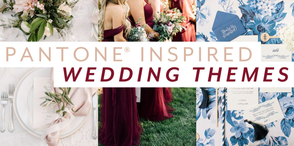
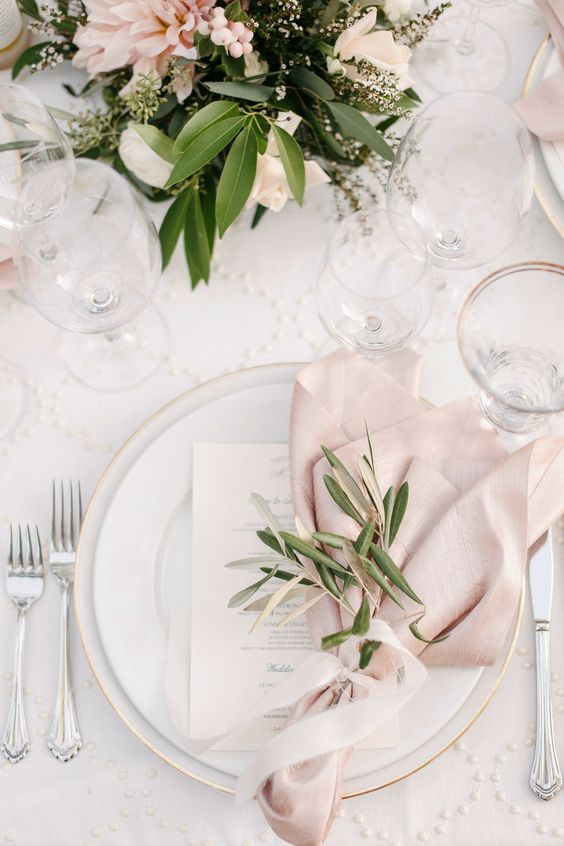
Instead of Blush go with…
Ballet Slipper!
Descended from the Red family but with a softer touch, Ballet Slipper is always flattering and reminiscent of the rosy glow of health.
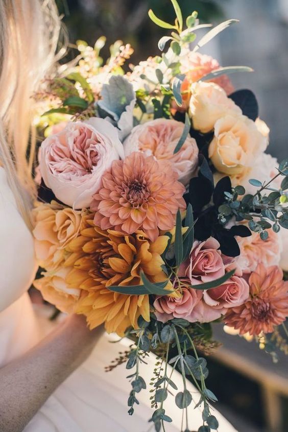
Instead of Champagne, go with…
Butterum!
This snug, warming, and toasty shade is evocative of drinking a glass of Butterum by a roaring fire on a cool autumn evening.
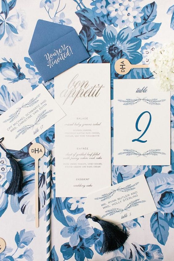
Instead of Aqua, go with…
Marina!
Cool with an enhanced vitality, Marina is the only truly cool color in the fall palette that brings with it freshness and brightness.
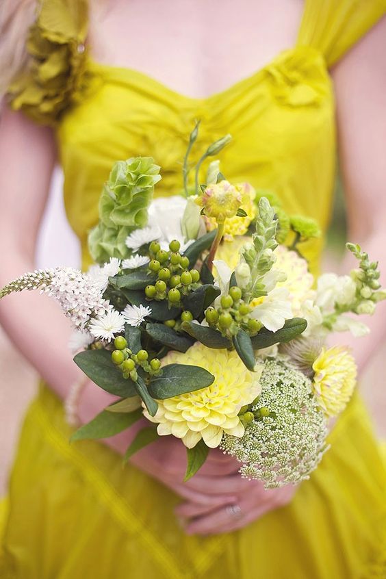
Instead of Seaglass, go with…
Golden Lime!
Earthy tones with a twist, the golden undertones of Golden Lime makes this yellow-green shade a refreshing complement to fall classics.
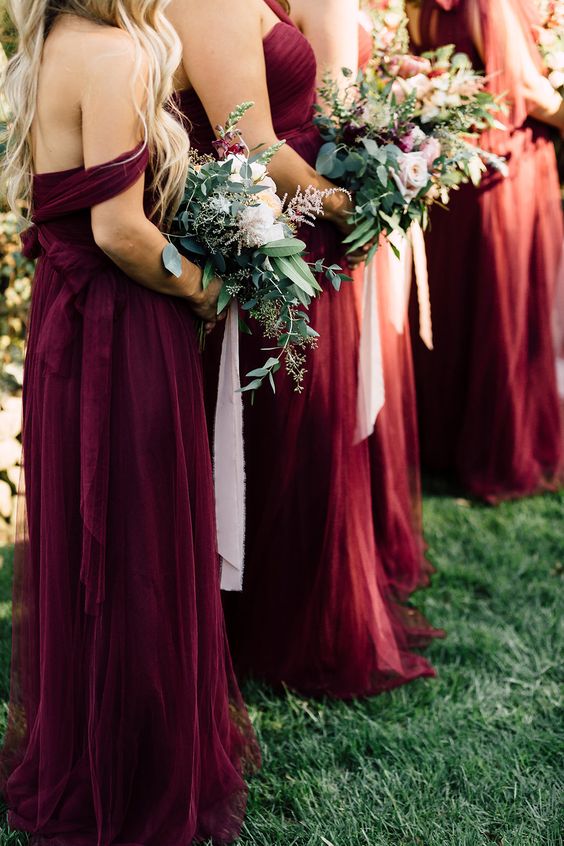
Instead of Marsala, go with…
Tawny Port!
Taking the Red family to new depths, Tawny Port is elegant, sophisticated, and tasteful.
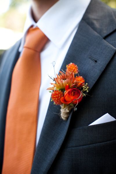
Instead of Gold, go with…
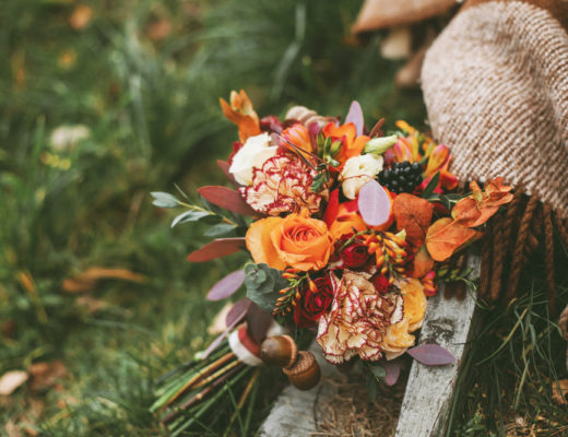
Autumn Maple!
A quintessential autumn color, Autumn Maple will introduce warmth into your palette.
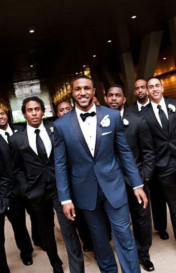
Instead of Black, go with…
Navy Peony!
Solid and stable, the hue takes some of the load off of black as a go-to neutral.
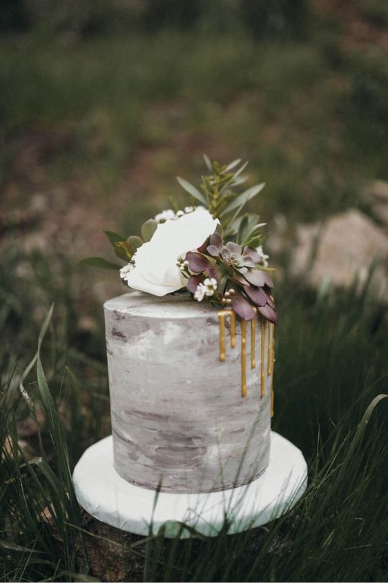
Instead of White, go with…
Neutral Gray
The standard bearer of all neutrals, Neutral Gray shares the anchoring role with Navy Peony in this palette.
Instead of Sage, go with…
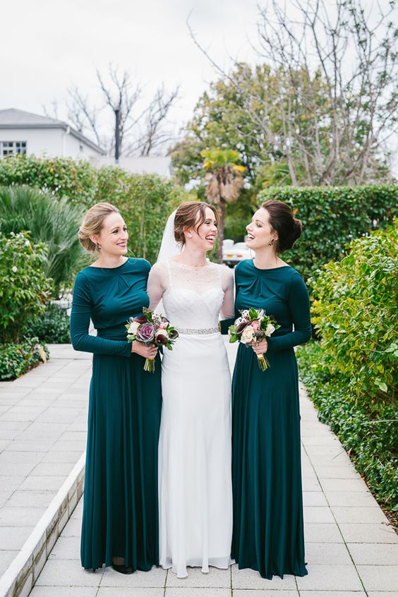
Shaded Spruce!
This is a green you might see in the forest, sheltering and protective as evergreen trees.
Instead of Peach, go with…
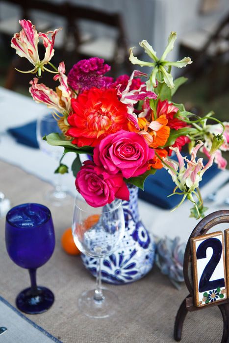
Grenadine!
A powerful, evocative, dynamic red, Grenadine is a confident and self-assured attention-getter.
For more destination wedding inspiration, be sure to visit our website, Pinterest and latest edition of Get Married Away!

